

Components
Every building block available to doc pages, in one place.
Text
Body text is 16px so long guides stay easy to read. You can use bold, italic, strikethrough, inline code, and links to other pages or to other sites.
A blockquote, for quoting a customer or pulling out a key line.
Third-level heading
Fourth-level heading
Headings show up in the "On this page" list on the right.
Lists
- An unordered list item
- Another item
- A nested item
- A last item
- First step
- Second step
- Third step
- A finished task
- An open task
Table
| Deck type | Typical length | Built from |
|---|---|---|
| Pitch book | 40–80 pages | Brief + prior decks |
| CIM | 60–120 pages | Data room files |
| Lender deck | 20–40 pages | Model + financials |
Callouts
Info
Use for extra context the reader might want.
Warning
Use when something could go wrong if the reader skips this.
Error
Use for things that will break or lose work.
Success
Use to confirm the reader is done.
Tip
Use for a shortcut or a better way to do something.
Cards
Decks
A card with an icon and a link.
Sheets
Cards sit two across on wide screens.
Spaces
And stack on phones.
No icon
Steps
Create a space
Give it the deal or client name.
Upload your files
Add financials, research, and past decks.
Ask for a deck
Describe the mandate in the chat.
Tabs
Accordions
Files
Controls
Write every clickable control with Ui, using the same icon the app shows.
- Click Share, then Publish new version.
- Icon-only controls get an outline: click More actions next to the person.
- Controls with no icon in the app stay plain bold: Make admin.
Keyboard shortcuts
Write keys with Shortcut, joined by +. mod is ⌘ on a Mac and Ctrl on Windows, and readers switch between the two at the bottom of the sidebar.
- Search with CommandKCtrlK, and start a new chat with CommandShiftOCtrlShiftO.
- When Windows uses different keys, pass
windows: CommandShiftHCtrlH. - Keys that are the same everywhere: Enter, Esc, ShiftF3ShiftF3, CommandUp arrowCtrlUp arrow.
Steps that only apply to one computer go in OnPlatform:
Screenshots
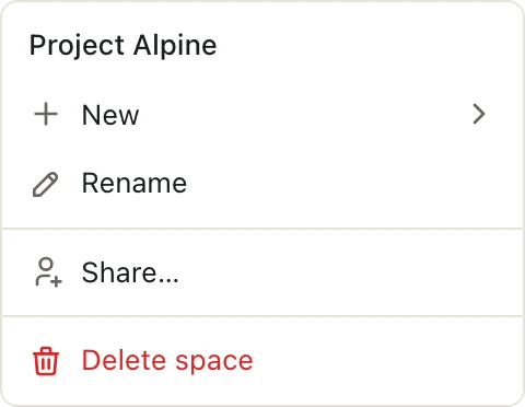
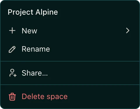
Screenshots sit on a tinted stage and switch with the reader's theme. Lone menus and dialogs have their own edge:
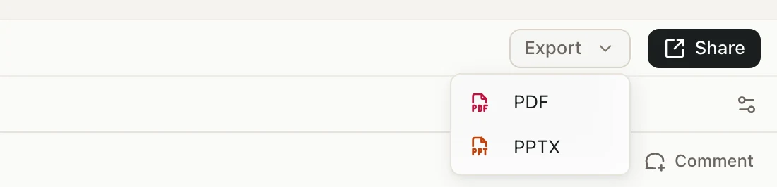
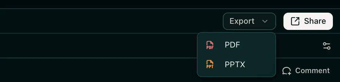
Slices of a full page add crop for an edge:
Images
A plain image:
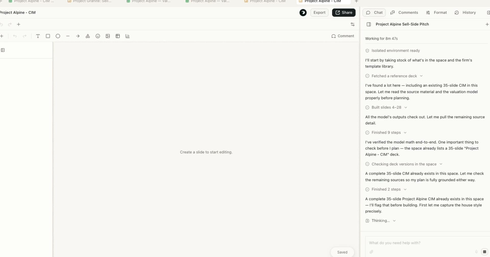
An image readers can click to zoom:

Code
Inline code for short values, and blocks for anything longer:
function greet(name: string) {
  return `Hello, ${name}`;
}{ "deck": "Project Alpine", "pages": 60 }Type table
Mostly for developer docs, like describing the fields in an API.
Prop
Type